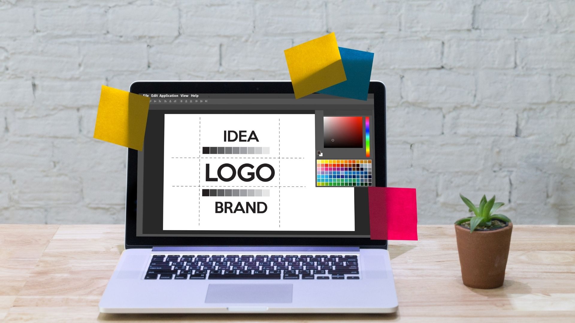
Your logo is your company’s fingerprint, an immediate endorsement by your brand on everything it touches, whether it appears on the top of your website or on the boxes holding your products.
Is Your Logo Delivering the Right Message?
The brand design agency GreyBox Creative says that a company’s logo is fundamental when it comes to crafting a strong corporate identity. Done well, it isn’t merely balanced and recognizable: Its design conveys the essence of your organization, including its core values.
What Can a Logo Communicate to Others?
Think of your company’s logo as if it were an expression on someone’s face. With a single glance, a properly nuanced logo can convey your company’s personality or persona to everyone.
It’s no accident, for example, that companies that want to be seen as earthy and approachable often use natural elements and earth tones in their logos. Simple fonts, bright colors, and whimsical designs can broadcast the fact that your company is fun and creative. Sleek designs in silver and black, on the other hand, are often used by tech companies to show that they’re modern and sophisticated.
Logos can also signify your commitment to the past — and your intention to change with the times. Consider the many incarnations seen in the logo for Starbucks over the years. Each design change over the years was aimed to bring the logo into step with the current era, without ever losing sight of the company’s core values or mission. Other brands have completely overhauled their logos to show that they’re stepping away from their past and moving in a new direction.
What Goes Into a Logo’s Message?
A logo is a wordless message to the world about your company, so it has to communicate a message through three basic methods:
- Color: Blue is seen as professional, dependable, and strong, while purple is creative. Red and orange convey energy and action, while yellow is positive and warm. Pink is youthful, green is healthy and associated with abundance, while brown is seen as simple and reliable.
- Font: A modern font in your logo can convey trendiness or intelligence, while fonts that mimic handwriting are seen as artistic and welcoming. Serif fonts are used to show that a brand is conventional and dependable, while a sans serif font is used to seem fresh and contemporary to consumers.
- Shape: Some logos skip words altogether in favor of a single, distinctive shape, while others combine shapes and words. Either way, the shape of the logo itself broadcasts a message to the viewer: Symmetrical shapes speak of strength and feel trustworthy, while asymmetrical shapes can express creativity or openness to new ideas.
Your logo is one of the primary ways you can separate your company from your competition and foster brand loyalty, so that means it’s worth getting right. Whether you haven’t yet settled on a logo for your company or you’re just not happy with the message that your logo is sending, working with a brand design agency can help make sure that everything your logo communicates is on point.


